Order fine stationery for the first time and you'll meet a small glossary that everyone assumes you know: deboss, emboss, blind, foil, engrave. They all mean "the expensive beautiful one," roughly — but they're five genuinely different physical events, they feel different in the hand, they suit different jobs, and knowing which is which is the difference between ordering what you imagined and being surprised at the unboxing. Here is the field guide, finish by finish, thumb-first.
Deboss: pressed IN
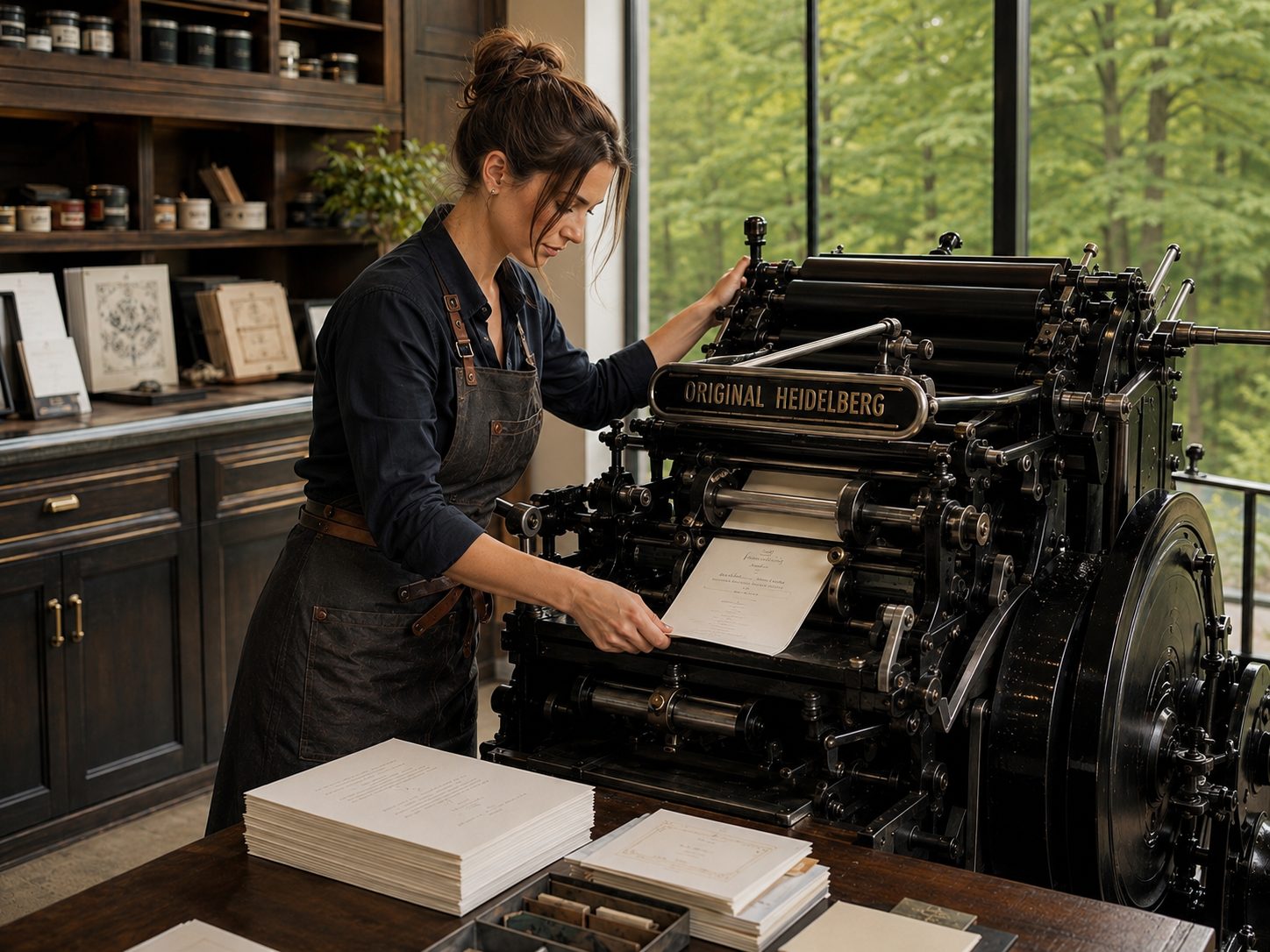
A relief die strikes the front of the sheet and the design sinks below the surface — valleys you can feel. Letterpress is, mechanically, an inked deboss: ink plus impression in one strike (the full story). Deboss reads as quiet, tailored, certain — the finish equivalent of a firm handshake. It loves thick, soft stock (the valleys need somewhere to go, which is cotton's whole argument) and crisp line-work over huge solid areas.
Blind deboss: the whisper
The same strike with no ink at all — pure sculpted shadow. The design appears and disappears as light rakes across it, which makes blind work the most quietly luxurious finish in the book: it can't be photocopied, barely photographs, and rewards exactly one person — the one holding the card. Monograms, borders, a maker's mark on the back flap. If deboss is a handshake, blind deboss is a nod across the room from someone who knows you.
Emboss: raised UP
The mirror image: a die and a counter-die squeeze the sheet from both sides, pushing the design up above the surface. Dimensional, assertive, catches light on its ridges — the finish of institutional seals, monogram-forward wedding suites, and logos that want altitude. The practical tells: embossing works the paper harder (fine detail limits), shows its "bruise" on the reverse (plan single-sided), and needs that two-part tooling, which is why it's typically a specialty add-on rather than an every-card finish. Blind emboss exists too and shares blind deboss's subtlety, elevated.
Foil: heat, metal, pressure
Hot foil stamping presses a heated die through a ribbon of metallic (or pigment) film, fusing a mirror-flat layer of actual material onto the sheet. It's the only way to get true metallic gold, silver, copper — ink can only approximate shimmer; foil is the shine — and, crucially, the only finish that stays fully legible on dark stock: white or gold foil on hunter green or navy is foil's home turf, where ink would sink and sulk. Foil can run flat ("kiss") or deep like letterpress. Its personality is celebration — the gilt edge of the finish family.
The two cousins, honestly
Engraving — ink pulled up from etched plates, leaving raised ink and a faint bruise on the back — is the old formal aristocrat: unmatched fineness of line, priced accordingly, worth it for the most formal suites. Thermography — resin powder heat-swollen over wet flat ink — imitates engraving's raise at a fraction of the cost; the tell is a glassy, slightly plastic sheen. No shame in it for business cards; know what you're buying for an heirloom.
Choosing, by job
- Everyday correspondence & notes: letterpress (inked deboss). Tactile, legible, ages beautifully — the house finish.
- The subtle flex: blind deboss — monograms, borders, backs of cards.
- Dark papers, metallic moments, celebration: foil, no contest.
- Dimensional logos and seals: emboss.
- Highest formality, budget unbothered: engraving.
- Combinations — letterpress text with a foil crest, blind border around inked type — are where suites get bespoke; each finish is a separate press pass, so each adds real cost and lead time. Worth knowing before the quote surprises you.
Whatever the finish, the fingertip is the final judge — order samples, close your eyes, and trust your thumb. It has excellent taste. (How the pressing actually happens: the Windmill.)